Scatter Graphs
Q1. Five well-known petrol stations record the total number of litres of unleaded petrol sold per day for a period of seven days. Information was recorded against the average cost of 1 L of petrol:
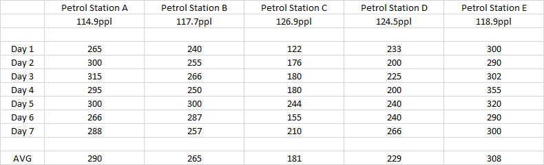
The average daily sale was recorded over this seven-day period and compared to the price per litre being charged. Plot the data on a scatter graph and establish any correlation, positive or negative and explain your reasoning.
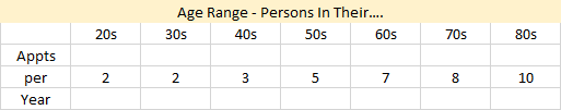
Q2. A survey was conducted across 100 patients at a local general practitioner as to how many times approximately a year they attend medical appointments. The hundred patients were split into "decade" age brackets and the results compiled thus:
Q3. Consider the following pairs of variables, and decide for yourself whether or not they are likely to show positive or negative correlation, or no correlation whatsoever. Explain your reasoning:
- The outside temperature and sales of ice cream.
- The outside temperature and sales of hot chocolate drinks.
- The outside temperature and bread sales.
- The age of a child and his/her height.
- The speed limit in the street and the average speed of cars as they drive down that street.
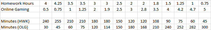
Q4. A survey was conducted of a class of 20 school pupils. They were asked how many hours on average a weekend they spend on the PlayStation / X - Box or on the Internet, and how long they spend completing schoolwork (homework / coursework).
Q5. Ewan wants to buy a particular car and has visited the local used car plot. There are several available with different prices based on mileage and other things.

- Plot, on a scatter graph, the given mileages against screen price.
- Draw a line of best fit through your points
- Predict what a car might cost if it was on offer with a mileage of 7600 miles
- What type of correlation does your plot show?
- What statement can you make about car price as the mileage increases?
Go To >> Solutions <<
Back To >> Scatter Graphs <<