Scatter Graphs
The scatter graph is a plot of two variables, often representing data from a survey or an experiment. Interpretation of a scatter graph can help to decide whether or not the outcome of one set of measurements is related in some way to the outcome of the second, for example could we say that the taller a person is, the larger his or her shoe size might be?
A scatter graph of suitably obtained data might help to strengthen or weaken such a prediction.
Let's take a look at an example of a scatter graph:
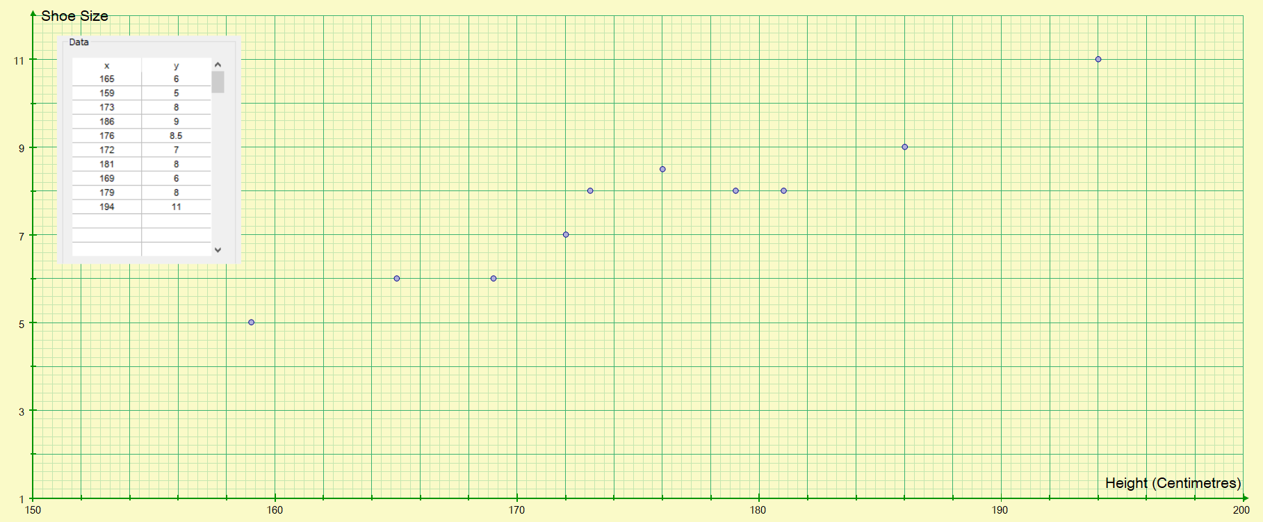
The data points on a scatter graph are not joined together, they are left as a random distribution because from this it is easier to interpret what the data is trying to tell us.
Correlation - the closer the points are to being in a straight line (if a line of best fit through the points was to be plotted) then the stronger the correlation is.
Positive Correlation - means the the variables increase and decrease together.
Negative Correlation - this means that as one variable increases, the other decreases, or vice versa.
We talk about correlation as being either strong or weak, and either positive or negative as we have explained above. In the example above we can say that there is a moderate positive correlation between the height of the person and the size of shoe that the person wears.
Example 2:
A survey was carried out amongst the group of older adults, to try to establish if there was a correlation between age and the existing number of natural teeth (the hypothesis being that it is believed that as people get older, they are likely to lose more and more teeth for various reasons). The information was charted and the scatter graph obtained shown below:
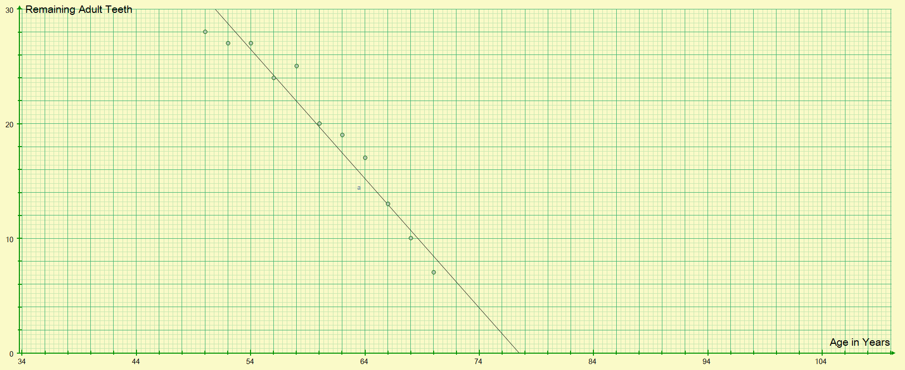
The data suggests that there is a moderate negative correlation in the data, as the age of the person increases it would appear that the number of natural teeth remaining will more than likely decrease.
>> Questions <<